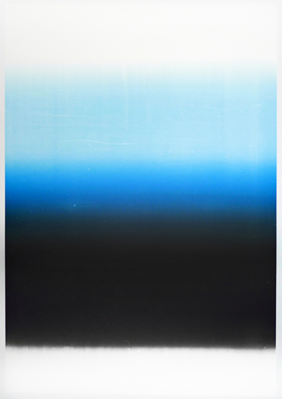
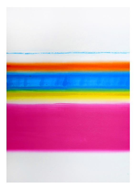
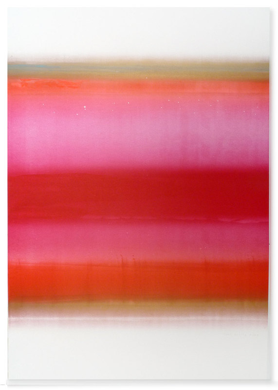
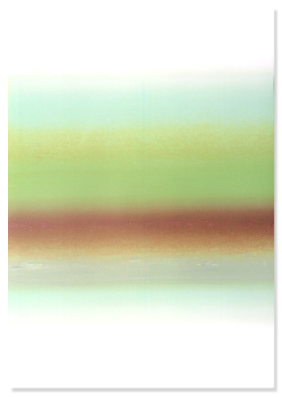
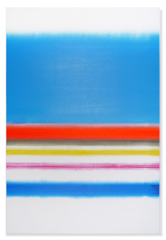
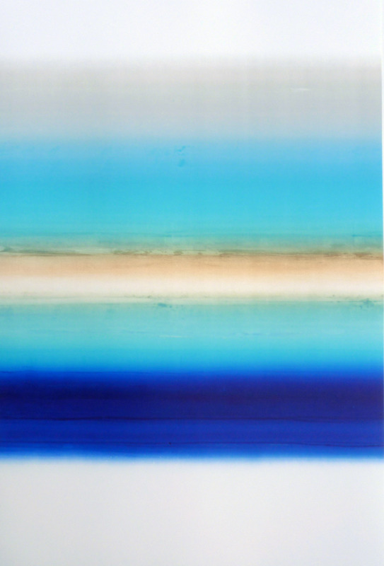
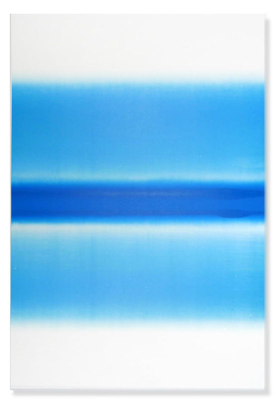
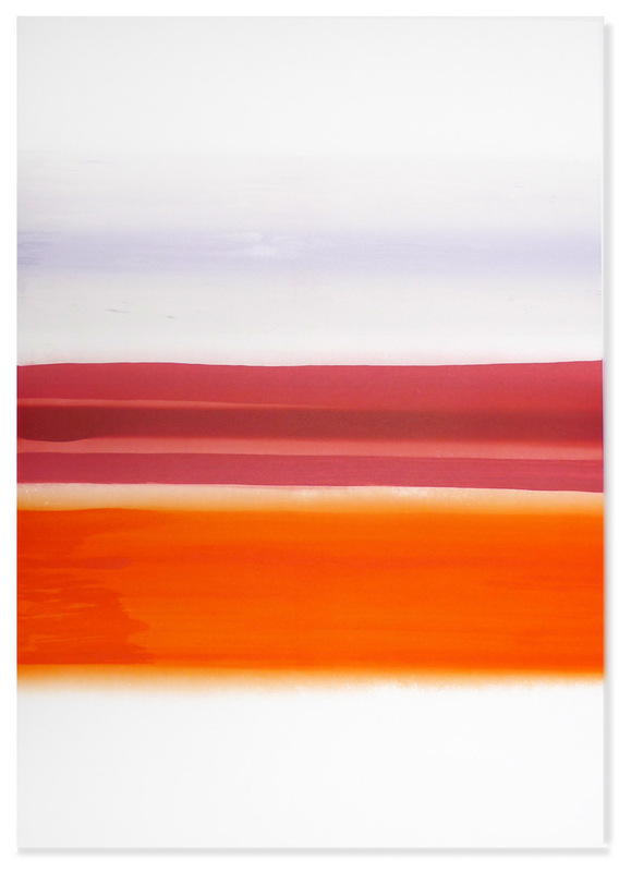
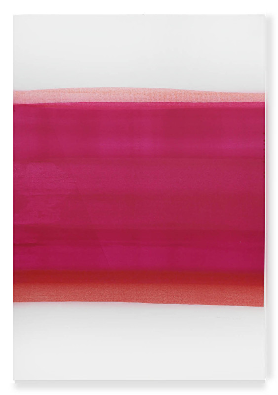
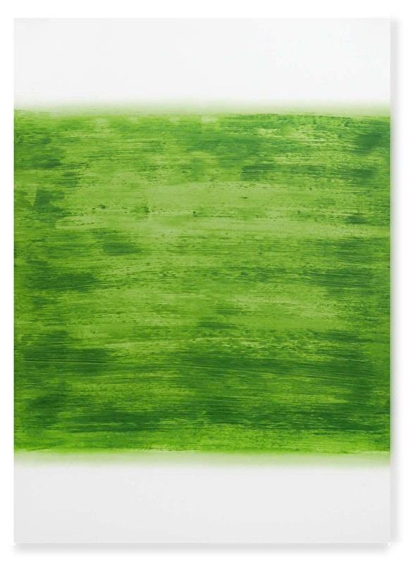
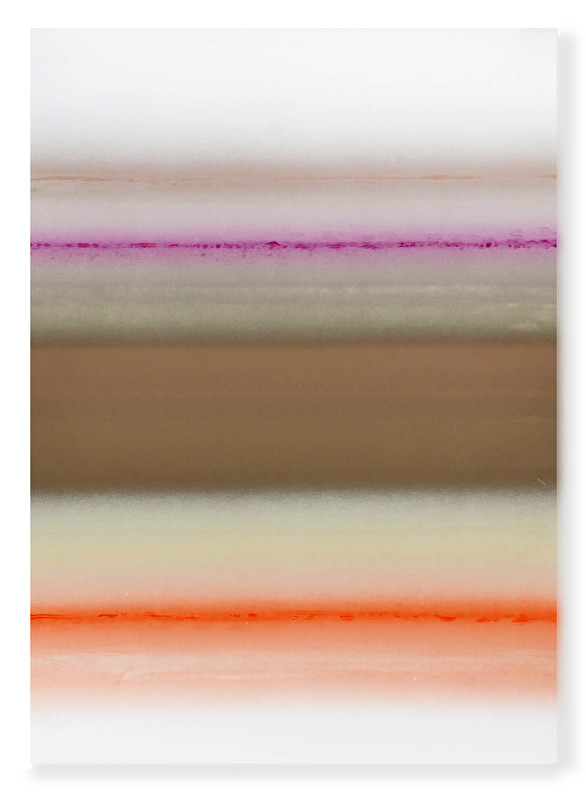
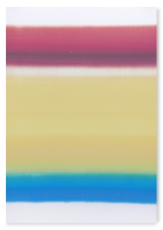
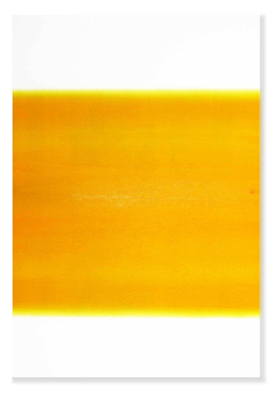
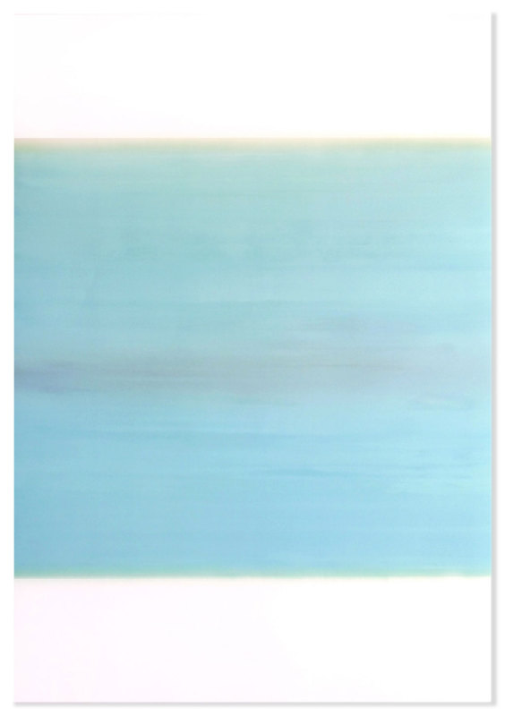
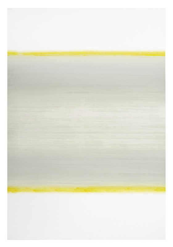
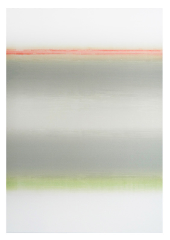
Monotyps | Pantone/Steinbecker on Bristol carton | each 100 x 70 cm
The best things in life are free... the second best are expensive - Coco Chanel
Abundance of Joy Text by R.A. Suri
For an artist who has proven to be as polyvalent as Marc Schmitz, whose chief operations lies within conceptual and philosophical frameworks, the appearance of a series of bi-chromatic/tri-chromatic monotype prints might disarm those accustomed to more visually complex creations.The works resonate with poetical beauty, the fruit of the random of creation.
Void of figurative relief, the series are in fact the result of a simplified mechanical process, colour saturation combined with a non-linear composition allows for one to absorb the primacy of emotive impact. In owing to whichever gradation or hue resultant from the simplest of print making technology, they are envisioned upon archival Bristol carton in optimal.
As an apart, in the literal sense, of former oil works which echo themes closely related to poetical inference and literati allegorical symbol, the monotypes assume a categorical “otherness” for the artist. The “other” in question is where philosophical connotations to nature achieves resplendance: colorist spectrum delivers an intense visceral impact and silences premeditations ascribed to the intellect.
Thus bereft of discursive elements, allegory or symbolic referentiality, the concept of the contemporaneous in practice is reduced to a plane of visual tension. This dynamic, visually reductive rather than minimalist in intent, offers works which are both exquisite and profound.
The spectrum yields minor gradations due to the process orientation of this experiment. The artist has not succumbed to absolutism nor embraced the parameters of minimalism, rather, sought to deliberate the rudimentary basis of colour beyond configuration. Due to the technical pull of the apparatus, the sheerness of saturation fades in slight as we are drawn from the central fore of each print, an absent “line” demarcates and seperates the visual composite due to process itself, while in fact, it works to complement the visual schemata.
Initiated in 2013, Marc began to develop his own technique of printing in the printworkshop Bethanien Berlin, which is one renowened, to experiment with an offset machine by overlying layers of prints to receive the blur at the edges, that he is interested in. The most these derivations of gaiety and spontaneity have been widely exhibited, chiefly, between Shanghai, Tianjin and the critically acclaimed Nakanojo Bienniale in Japan.
The greater number untitled, it appears the signature is left to one where the spectator is denied literary reference and left to interpret in a relatively “oblivious” manner. Several, bearing names which refer to seasonal change, infer that the artist has opted for a reasoning of a chronological fascinus which incurs the latency of historico-socio tradition in their indication of leitmotif/symbolic passage of time. A manifest dedication to color, the series aspires to enliven the joy of life within their naïve employ, both exquisite given their aesthete quality and profound within a prominent simplicity.
Poetical inference and literati allegorical symbol, one could just enjoy color, imagine a gazeous state or even take the works as decoration. Simply the clearness of the single prints by pointing out a very specific coming together of at least two shapes of color
All monotyps are unique original art works printed with Pantone / Steinbecker on Bristol carton, each 100 x 70 cm. All Monotyps where created at the printworkshop Künstlerhaus Bethanien in Berlin Kreuzberg, Germany.
The monotyps have been exhibitted internatioanlly as in TEDA Contemporary Art Museum Tianjin, Goethe institute Hong Kong, Galerie Seitz & Partner Berlin, moproo Shanghai, Nakanojo Biennial Japan, Art Chengdu (China) and ARCO Madrid, beside others.